Case study
Logo &
Branding
01. Wordmark Design
02. Scalable Visual Identity
03. Symbolic Logo Design
A Minimal Wordmark for a Data-Driven Global Consultancy
Infocion
A global digital consulting firm specializing in Data Engineering, AI & Advanced Analytics, and Cloud Data Solutions, with deep expertise in life sciences, healthcare, and manufacturing.
Project Scope
- Wordmark Logo Design
- Minimal Visual Identity
- Typeface & Color Strategy
- Scalable Logo Assets for Digital Use
The Challenge
Infocion operates in high-complexity, data-driven industries where clarity, trust, and professionalism are key. The client requested a clean and minimal logo that would reflect their technological focus without unnecessary flair — something that felt modern, reliable, and scalable across platforms. The branding needed to feel neutral yet distinctive, and professional without being cold.
Our Approach
To reflect Infocion’s emphasis on data precision, digital innovation, and global trust, we focused on clarity and timelessness. Instead of a symbol-based mark, we developed a refined wordmark — clean, confident, and quietly authoritative.
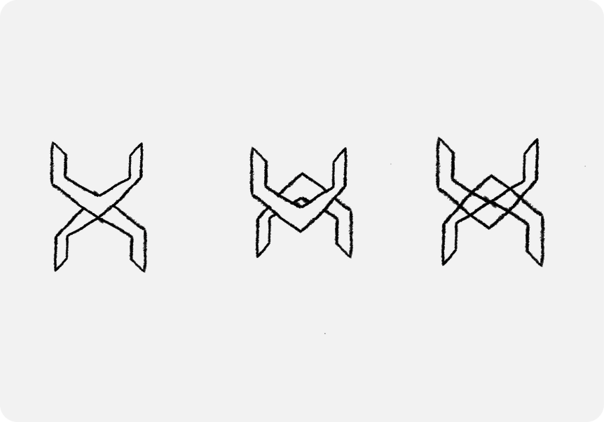
Early sketches

Logo Concept
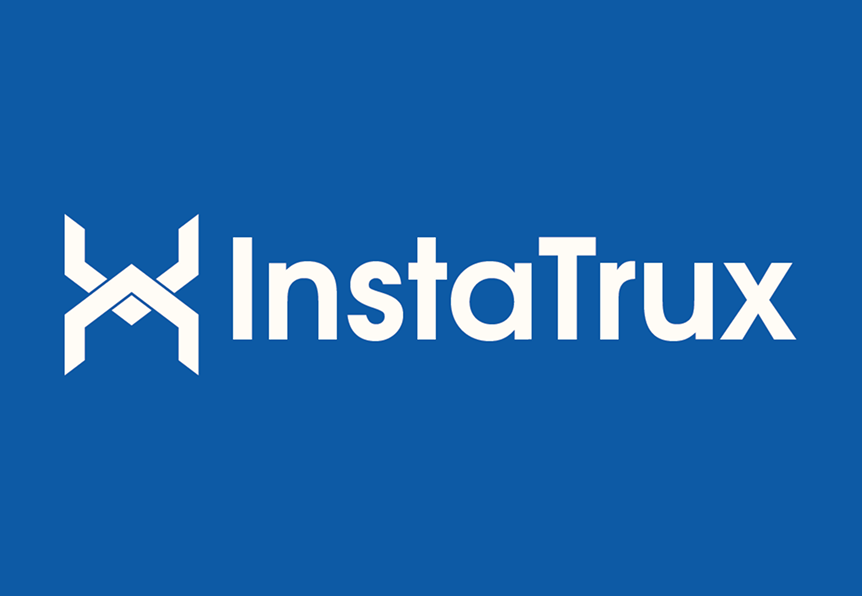
At the heart of the identity is the Instatrux logo, built on a clean and meaningful visual narrative.
- Wordmark Focus:
We designed a pure wordmark logo, staying true to the client’s request for something minimal, clean, and modern. The absence of iconography makes the brand feel boldly straightforward — ideal for a company whose core value is clarity in complexity.
- Font Selection:
We used a customized sans-serif typeface for its crisp, highly legible geometry. The sharp lines and generous spacing create a look that’s both tech-forward and globally accessible, ensuring usability across all formats — from dashboards to decks.
Together, the mark and logotype form a balanced, modern identity that communicates strength, clarity, and connection.

Color System
The color system was kept minimal and versatile:
- Black
Professionalism, authority, and sophistication.
- White:
Cleanliness, simplicity, and clarity — aligning with Infocion’s transparent approach to consulting.
- Light Green (Accent)
Used sparingly to signal innovation, progress, and the energy behind smart, data-driven transformation.
This palette allows the brand to feel neutral and adaptable in B2B contexts while retaining a subtle touch of vibrancy.

Scalability & Versatility
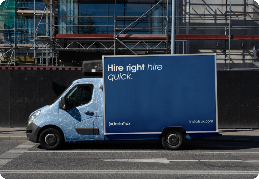
The logo system was designed for maximum flexibility, functioning flawlessly across digital environments, slide decks, emails, terminal dashboards, internal tools, and client-facing assets. Its simplicity ensures clarity at all sizes, without sacrificing visual identity.
Results & Brand Positioning
The new identity helped position Infocion as a confident, future-ready consultancy with global credibility. The branding reinforces their promise to bring clarity to complexity — especially in high-stakes industries like pharma, healthcare, and manufacturing.
The wordmark:
- Builds instant trust with enterprise clients
- Supports Infocion’s goal of neutrality across multiple industries
- Aligns with the tone of high-level consulting and data leadership

Results
The final brand identity positioned Instatrux not just as another logistics platform — but as a movement toward more human, more transparent trucking. The visual system feels bold, tech-forward, and meaningful — aligning perfectly with Instatrux’s mission to build lasting relationships and trust across the industry.
Tools Used
- Adobe Illustrator
- Procreate
- Adobe photoshop
- Color Accessibility Testing
Conclusion
In a world flooded with noisy tech brands, Infocion stands out by keeping it clear, focused, and intentional. This minimal wordmark reflects their philosophy: data-driven decisions, built on a foundation of clarity and integrity.
Want branding that reflects your values with precision and impact?
Let’s build something clean, smart, and scalable — just like we did with Infocion.

