Case study
Logo &
Branding
01. Logistics Branding
02. Connection-Led identity
03. Symbolic Logo Design
Branding a New Era of Trust in the Trucking Industry
Instatrux
A platform revolutionizing the connection between truck drivers and small businesses by putting transparency, reliability, and human connection at the heart of logistics.
Project Scope
- Logo Design
- Visual Identity System
- Brand Guidelines
- Color Palette & Typography
- Scalable Assets for Digital & Print Use
The Challenge
Instatrux set out to disrupt the traditional trucking industry — an industry long dominated by transactional relationships, fragmented systems, and a lack of transparency. They needed a bold and trustworthy brand identity that could signal clarity, human connection, and innovation from the first glance. The brand needed to resonate with both ends of the spectrum: truck drivers looking for reliability, and small business owners seeking dependable logistics partners.
Our Approach
To bring Instatrux’s mission to life visually, we took a solution-first approach to branding, combining strategic symbolism with clear, modern design. Every element of the identity had to reinforce three core values: connection, transparency, and reliability.
Early sketches
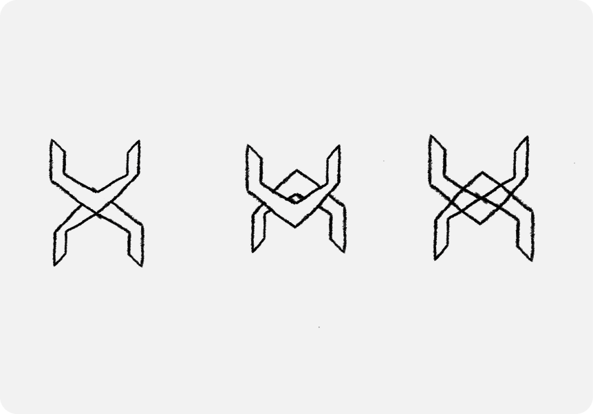
Logo Concept
At the heart of the identity is the Instatrux logo, built on a clean and meaningful visual narrative.
- The Mark:
The logomark is a simplified intersection of two arrows, representing the constant flow of goods and the real-time connection between businesses and truck drivers. This directional symbolism reflects movement, clarity, and partnership.
The intersection also subtly forms an ‘X’, a strong visual cue that ties directly to the brand name InstaTrux, reinforcing memorability and distinction in a competitive space.
- The Logotype:
We customized a typeface inspired by TeX Gyre Adventor, crafting a seamless integration of the capital “I” and “T” — the initials of Instatrux. This detail not only creates visual harmony but also reflects the focused and structured nature of the service.
Together, the mark and logotype form a balanced, modern identity that communicates strength, clarity, and connection.
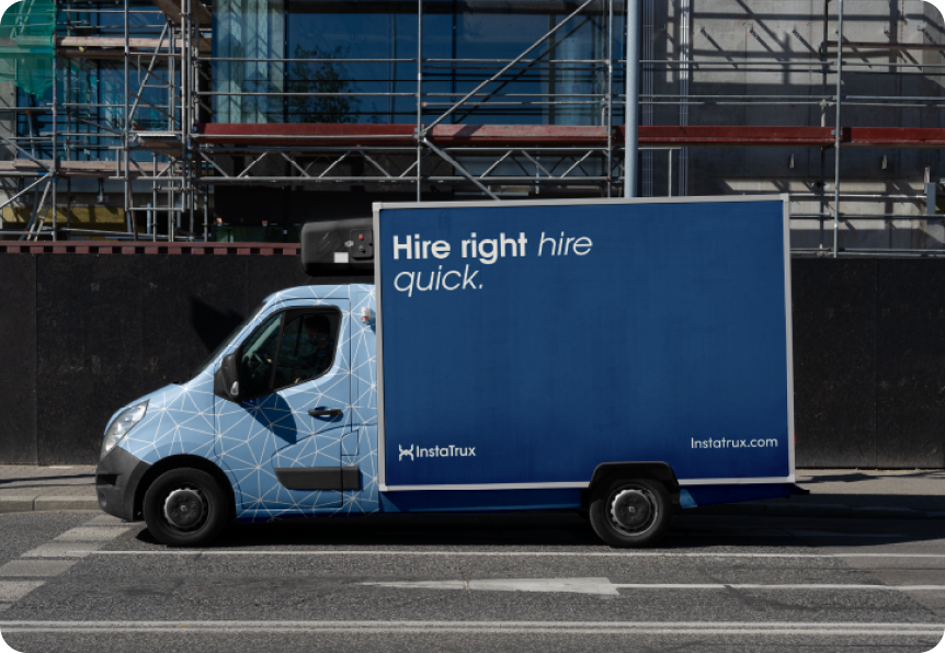
Color System
Instatrux’s primary color palette was selected to evoke trust, modernity, and a professional tone — while standing out in a typically industrial market.
- Medium Teal Blue:
Symbolizing trust, dependability, and clarity — this color reflects the platform’s commitment to transparent communication and seamless connections.
- Off White:
Clean, neutral, and minimal — this tone complements the primary blue while ensuring readability, balance, and visual breathing space across all brand assets.
The ratio and prominence of these colors were carefully calculated to maintain consistency and impact across print, web, and mobile platforms.
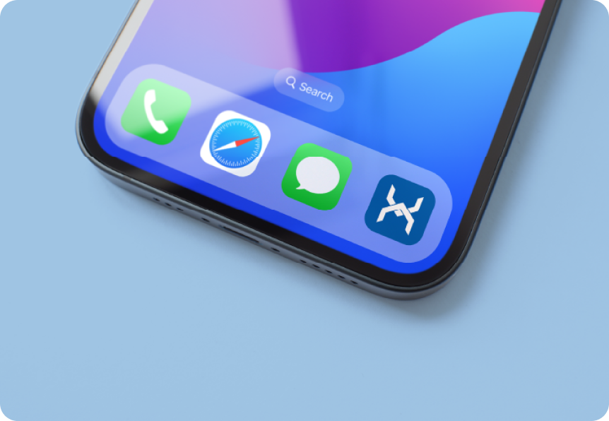
Secondary Logo System
To ensure flexibility and consistency, we created secondary logo variations that adapt seamlessly to different applications — from mobile UI to vehicle branding. These retain the brand’s identity while enhancing usability across various touchpoints.
Each secondary mark adheres to a cohesive system outlined in the brand guidelines — allowing internal teams and partners to apply the branding confidently and correctly in any context.
Results
The final brand identity positioned Instatrux not just as another logistics platform — but as a movement toward more human, more transparent trucking. The visual system feels bold, tech-forward, and meaningful — aligning perfectly with Instatrux’s mission to build lasting relationships and trust across the industry.
Tools Used
- Adobe Illustrator
- Procreate
- Adobe photoshop
- Internal Brand Guideline Framework
Conclusion
At MindMayStudio, we don’t just design logos — we build brand systems that speak. For Instatrux, this meant creating a mark of trust in an industry built on movement. With purpose-driven design, we helped bring their vision to life — from pixels to presence.
Looking to craft a brand identity that drives impact?
Let’s build something meaningful together.